Home
Hot Glue
Processing
Visual Design
Mobile Applications
Reading Tasks
The primary benefit of HotGlue is the ability to edit the page instantly whilst viewing it. You can move, scale, edit and even 'drag and drop' images into the browser window. The user isn't restricted by newspaper-like column layout, it allows free-hand 'drawing' and composition of the elements of a web page.
Available to the editor are a handful of tools. These are simple design tools that appear with a single click, double click, or when a specific object is selected.
After the first few uses of HotGlue the drawbacks became evident. The main defect of HotGlue is it's unresponsiveness on different devices. I navigated to my HotGlue site on six different devices (See table below), these each had various viewports.
So the answer might be..
As explained by
nngroup.com. 'Responsive web design (RWD) is a web development approach that creates dynamic changes to the appearance of a website, depending on the screen size and orientation of the device being used to view it.'
So viewing it on a phone will look different to a tablet and different to a desktop monitor.
HotGlue is a content manipulation system. It allows you to create
webpages without any prior knowledge of programming and with
this in mind, you can make your HotGlue website as simple or as
complicated as you like.
A double click in an empty space delivers a menu for editing the page.
When a specific element such as a picture or a block of text (as shown here) is selected the editing menu appears along the left-hand side and along the top of the object.
Using these buttons provided the text will change in real time so you can see how it will look. What you see is what you see! This allows the designer to play around with the different objects much more, than perhaps conventional web design.
A single click in an empty space delivers the new object menu.
Some of the buttons such as the 'change transparency' are reactive to your mouse movement. By clicking, holding and dragging left or right you can change the opacity. I feel frustrated by this function as I like to input a set value and not do it by eye.
'get name of object' button will be useful for linking within a page or to specific areas within the site. It works similarly to HTML anchors. I will likely test this to ease navigation within my portfolio.
Edit Text Element - This menu appears along the top when the element is selected.
I discovered that by pressing shift and then clicking on the 'change colour' or 'change font colour' buttons, you are able to enter a hexadecimal colour code or RGB decimal colour code. These codes are used to specify colours and keep them consistent across the site.
I think HotGlue should make use of this function by applying it to transparency and font size. This will help with precision and consistency across the site whilst designing.
HotGlue supports text, images, gifs, videos (embedded or uploaded), Sound Clips (embedded or uploaded) as well as other embedded content through the use of iframes (Inline Frames). An iframe is used to insert another website document into your own website. An example of this would be to embed a vimeo video.
In the text element you can also write Hypertext Markup Language (HTML) and javascript along with your plain text. HotGlue will attempt to work out what you mean.
Above is a mix of plain text with HTML and in-line CSS.
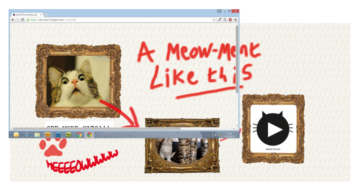
Find out more, watch this short video from hotglue.me:
Web Designers and Developers these days have to constantly keep up with the almost endless new devices and resolutions propelling themselves on to the market. It wouldn't be fruitful to design and build for each device, by the time you'd finish, another isomething with a super retina display will be on the market slightly bigger or smaller than the last.
Figure. 1
I designed my site on a desktop monitor measuring 1920x679px. This is a fairly wide screen. Due to the nature of Hotglue (wherever you place something, it will stay there) this caused a problem.
I first viewed this site on a Toshiba Ultrabook. The 14inch screen, which slightly smaller than the original screen the site was designed on resulted in the viewport seemingly zoomed in, as seen in fig.2. This meant that you had to scroll sideways to view all the content (which when I first designed it was meant to fit on the whole screen).

As fig.1 shows most of the handheld devices re-scaled proportionately to fit portrait in the view port. But this meant, especially with the iphones, you had to scroll sideways to view the rest of the content.
There was only one issue with playing content across the seven devices. For some reason the Youtube video embedded in my site would not appear on the Toshiba Ultrabook.
I found it difficult to debug and find what was causing the issue. The iframe 'box' for the YouTube video was visible, but it had no content within it. The only option to resolve this was to re-embbed the video again and clear my browser cache. This worked and the video appeared and played correctly on my devices.
I believe that it's relevant, the process of comparing and documenting different environments in which the site can be viewed. It's something which I will need to keep in mind in future when designing a website or for mobile. I think it's important to always consider the end user, especially in a world where we are seeing the mobile being used more often. It's no good if the site looks amazing on your screen, but then the final users don't have that size screen.
To conclude, I believe HotGlue is a great tool to create a quick website without knowing code and confining yourself to the 'newspaper column' style layout that we all too commonly see online. Perhaps it's best served as a portfolio site or as a digital poster to advertise an event. The biggest downfall of HotGlue is it's unresponsiveness and having no particular control over content, as you would with Content Management Systems such as Wordpress.
Figure. 2
During a WDS session I compared my result with others in the class and we entered our data into a table shown in figure.1. This allowed us to compare our results across different variables.
BACK TO TOP
References:
1.) Paper Background images - http://naldzgraphics.net/textures/lined-paper-texture/